Explore Our Dashboards
How do images shape public debate—and how can we better understand their persuasive power online?
As part of the PolarVis project, we created three interactive dashboards that offer different windows into the visual politics of climate communication on social media. Drawing on research across Europe, the dashboards allow users to explore how images are used to engage, persuade, and polarise in digital spaces.
Whether you’re a researcher, communicator, or simply curious about online debates, these tools invite you to explore patterns of visual messaging, emotional responses, and evolving communication strategies. Developed through a collaborative, co-design process, they are meant to support reflection, comparison, and more informed engagement in a changing media landscape.
The PolarVis Social Media Dashboard
The dashboard was developped and designed by Hana Dubovska.
The PolarVis Polarisation Dashboard
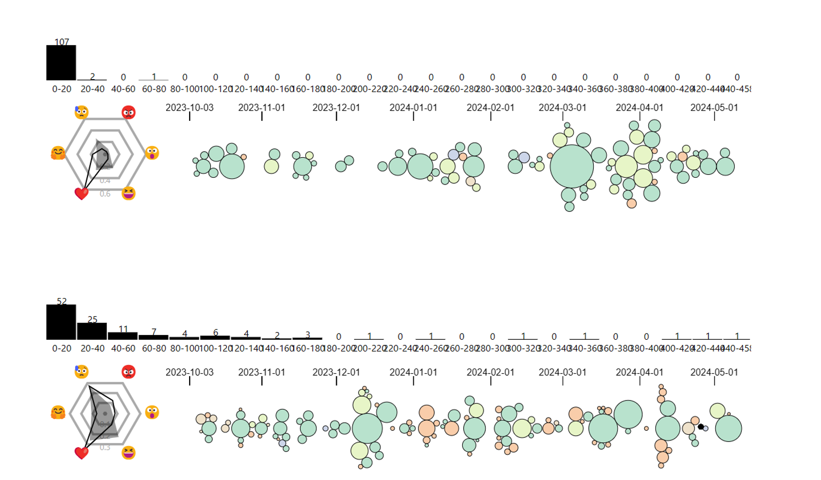
The PolarVis Workshop Dashboard
The Workshop Dashboard was developed as a hands-on tool to support collaboration between researchers and climate communicators. Built on co-design principles, it is used in local workshops with stakeholders working to engage citizens around climate issues.
The goal was to create a space for shared reflection: while communicators often know what works in their own context, it’s harder to compare strategies across different actors. This dashboard makes such comparison possible by highlighting differences in visual messaging, emotional tone, and engagement.
By drawing on workshop participants’ contextual knowledge and feedback, the dashboard evolved into a tool that helps uncover patterns, spark discussion, and support more effective and reflective communication practices.